Connecting Order History and Order Receipt so customers could recognize purchases, understand their status, and take the right next action.
Role
Duration
Tools
Team

Project Overview
I redesigned two connected areas of Skechers’ post-purchase experience. I first transformed Order History into a visual, scannable overview that helped customers recognize and open past purchases. I then extended the experience into Order Receipt, where customers could understand item-level status and complete relevant actions such as tracking, cancellation, returns, reviews, and repurchasing.
3%
Increase in onversion after Order History launch
19%
Increase in engagement with the redesigned page
25%
Increase in clicks from Recent Purchases to Order History
18%
Buy Again engagement among first-time users on Order Receipt
The Challenge
The existing Order History relied heavily on item numbers and text. It did not show product imagery, clearly communicate the current order status, or give customers an intuitive way to open and manage a purchase.
After locating an order, customers also had limited self-service options within the detailed Order Receipt experience.
The Opportunity
Order-Level Clarity
Make past purchases easier to recognize and scan through product imagery, visible status, quantities, and consistent order metadata.
Item-Level Action
Once an order is opened, surface the information and actions relevant to each item’s current stage.


I examined the experience across two connected areas:
Order History
Returning customers use Order History to scan past purchases, recognize products, understand each order’s overall status, and select an order for more detail. The redesign introduced visual, clickable cards with product imagery, quantity and overflow treatments, consistent order metadata, and clear status labels.
Order Receipt
Order Receipt appears immediately after checkout and can also be reopened from Order History. It provides item-level details and surfaces actions based on each product’s current state, including tracking, cancellation, returns, reviews, and Buy Again.

Phase I - Redesigning Order History
The original Order History experience relied on item numbers and text, making past purchases difficult to recognize at a glance. It did not clearly communicate an order’s current status, show the products included, or provide an intuitive entry point into the full order.
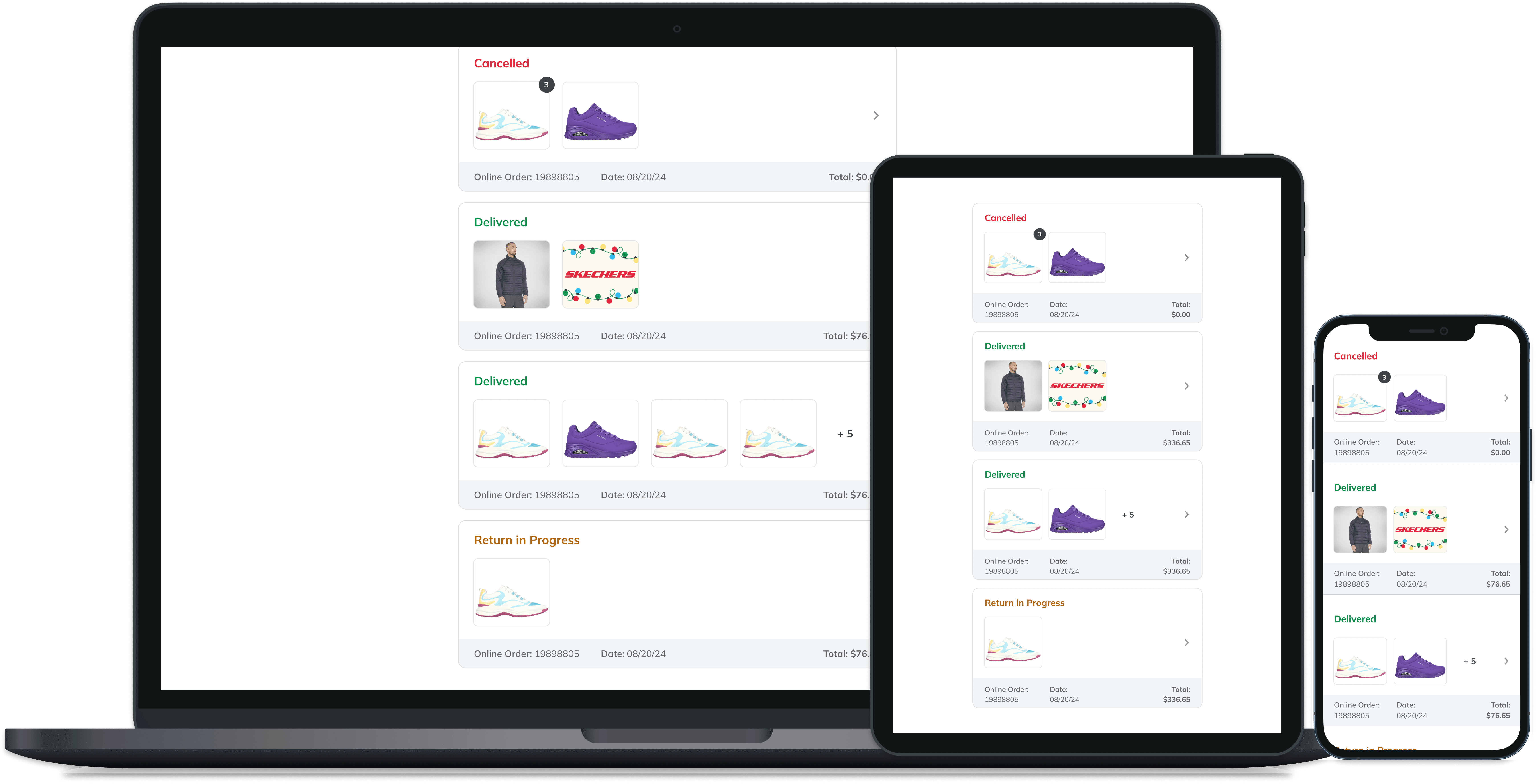
I redesigned the page around visual, clickable order cards that surfaced the information customers needed to identify a purchase before opening it. Each card displayed product imagery, overall status, online order number, order date, and total. The card system also accounted for multi-item orders, repeated quantities of the same product, and orders containing more products than could be displayed at once.

Card Anatomy
Each Order History card was designed to help customers recognize a purchase before opening it. Product imagery and overall status provide immediate context, while consistent metadata supports verification. Quantity badges and overflow counts communicate larger or repeated orders without overcrowding the card, and the chevron makes the transition into full order details clear.

Designing for Different Order Compositions
Orders could include a single product, several different products, multiple quantities of the same item, or more products than the card could display. I defined responsive card rules for each scenario, ensuring customers received an accurate and scannable summary across desktop, tablet, and mobile. Quantity indicators identified multiple units of the same product, while an overflow count showed when an order contained more items than the card could display. Customers could select the card or arrow to open the full order and view every product included in the purchase.
I also introduced a loyalty-status pill that displayed the points earned from each purchase. Its placement and spacing adapted across breakpoints, allowing customers to quickly understand both their order and its loyalty value without competing with essential details such as status, date, and total.

Phase II - Extending the Experience to Order Receipt
Designing a Flexible Status and Action System
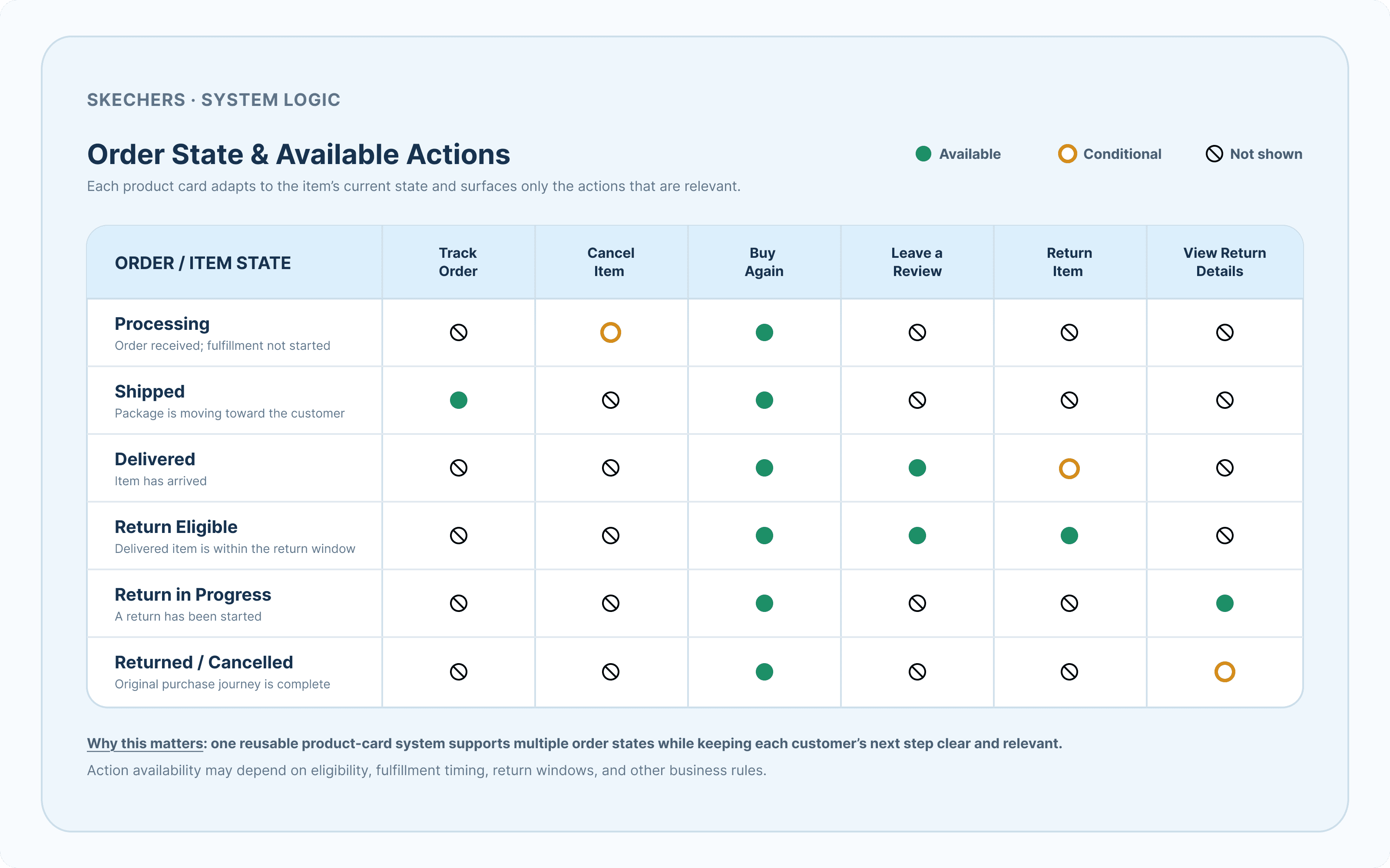
Because customers’ needs change throughout the order lifecycle, a single static product card could not support every scenario. I designed a flexible card system that adapted its status, messaging, and available actions based on whether an item was processing, shipped, delivered, cancelled, or returned.
Before moving into detailed UI design, I mapped each order state to its relevant actions. This created a consistent framework for item-level status and actions within Order Receipt, while preserving the connection back to the order-level status shown in Order History.

Working Within the Design System
One of the original project constraints was that no new design elements should be introduced. The experience was expected to use components that already existed within Skechers' design system.
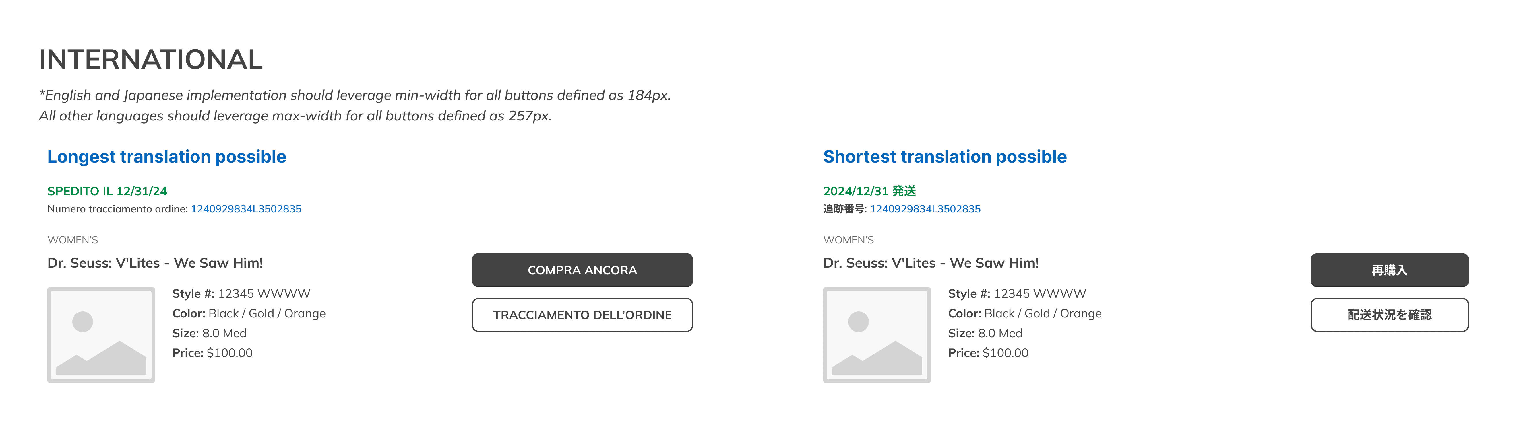
However, even the smallest existing button occupied too much space when several actions needed to appear on one product card - particularly on mobile screens and in languages with longer translations.
I explored multiple configurations using the existing components, but the available button sizes created unnecessary visual weight and limited the number of actions that could be displayed clearly.
After reviewing the iterations with product and stakeholders, I proposed a smaller button variation. I explained how it would improve responsive behavior, preserve hierarchy, and support multiple contextual actions without overwhelming the card. The team approved the recommendation, and the smaller button became part of the final experience.

Establishing an Action Hierarchy
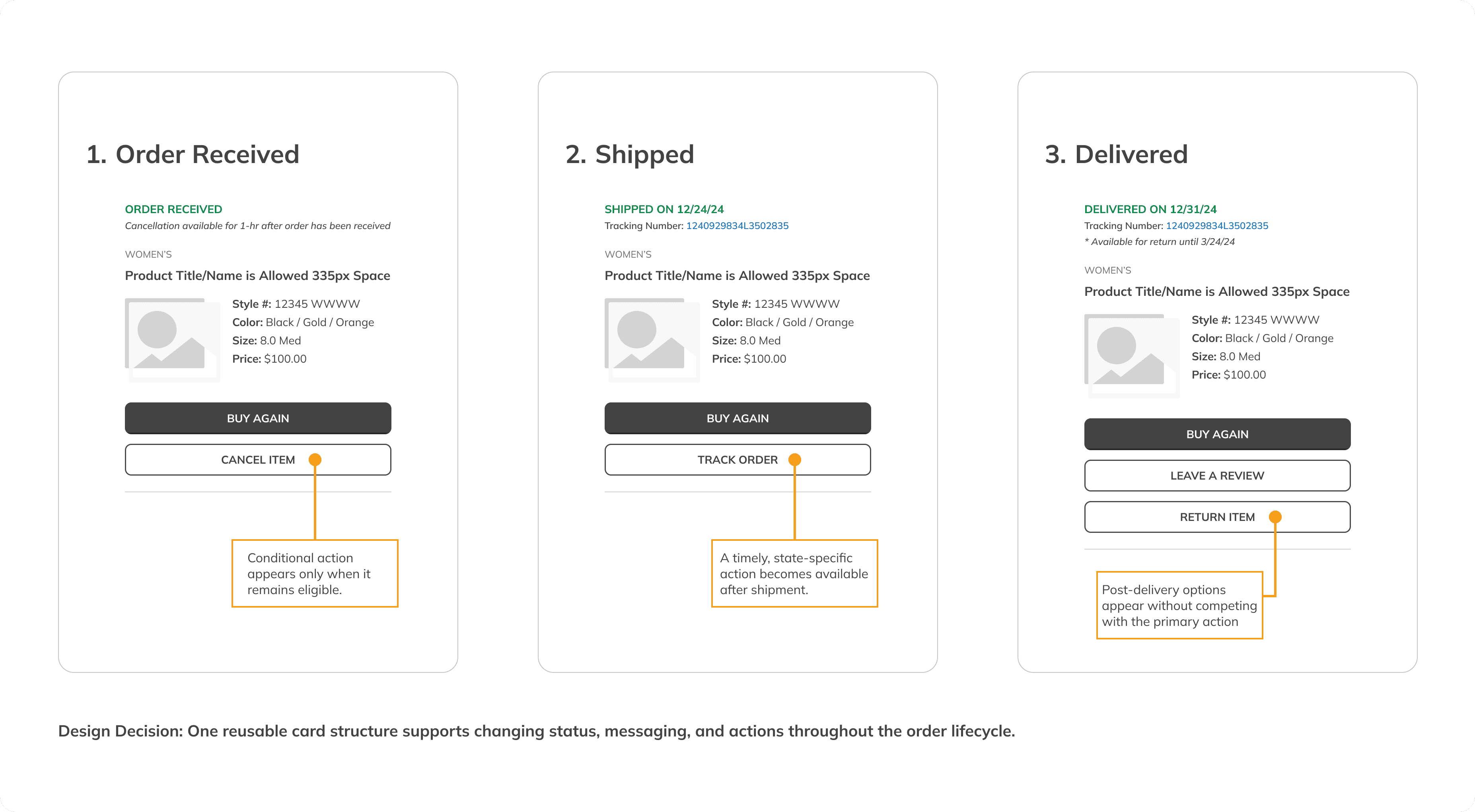
Not every action required the same level of emphasis. I organized actions according to their relevance to the customer's current order state. The most timely or commonly needed action received greater visual priority, while secondary actions remained available without competing for attention.
Tracking became prominent after an order shipped.
Cancellation appeared only while the order remained eligible.
Return actions appeared after delivery and according to regional policies.
Leave a Review appeared after an item was delivered.
Buy Again remained available as a repeat-purchase opportunity.
Collaboration and Iteration
As the sole UX designer, I owned the connected experience across Order History and Order Receipt. I presented concepts and iterations to product managers, engineers, e-commerce leadership, stakeholders, and customer-service partners.
For Order History, review sessions helped the team align on card structure, status visibility, product-image rules, repeated quantities, overflow behavior, and the transition into full order details. For Order Receipt, we worked through item-level actions, technical and design-system constraints, regional policy differences, responsive behavior, and localization needs.
Engineering feedback shaped what could be supported within the existing platform, while stakeholder and customer-service input helped prioritize the information and self-service actions that would provide the most value.
The Final Experience - Overview
The final design introduced a connected system of responsive product cards, contextual status messages, and order-management actions across the Order Receipt and Order History pages.
Instead of simply viewing order information, customers could understand their order status and take action directly within the experience.
Track orders more clearly.
Cancel eligible items without calling customer service.
Begin or review a return.
Leave a product review.
Repurchase an item.
Understand the status of individual products within an order
The complete experience launched successfully. The same product-card pattern was later applied to Recent Purchases, extending the design beyond the original project.
Order History Solution

Order Receipt Solution



Responsive and Global Considerations
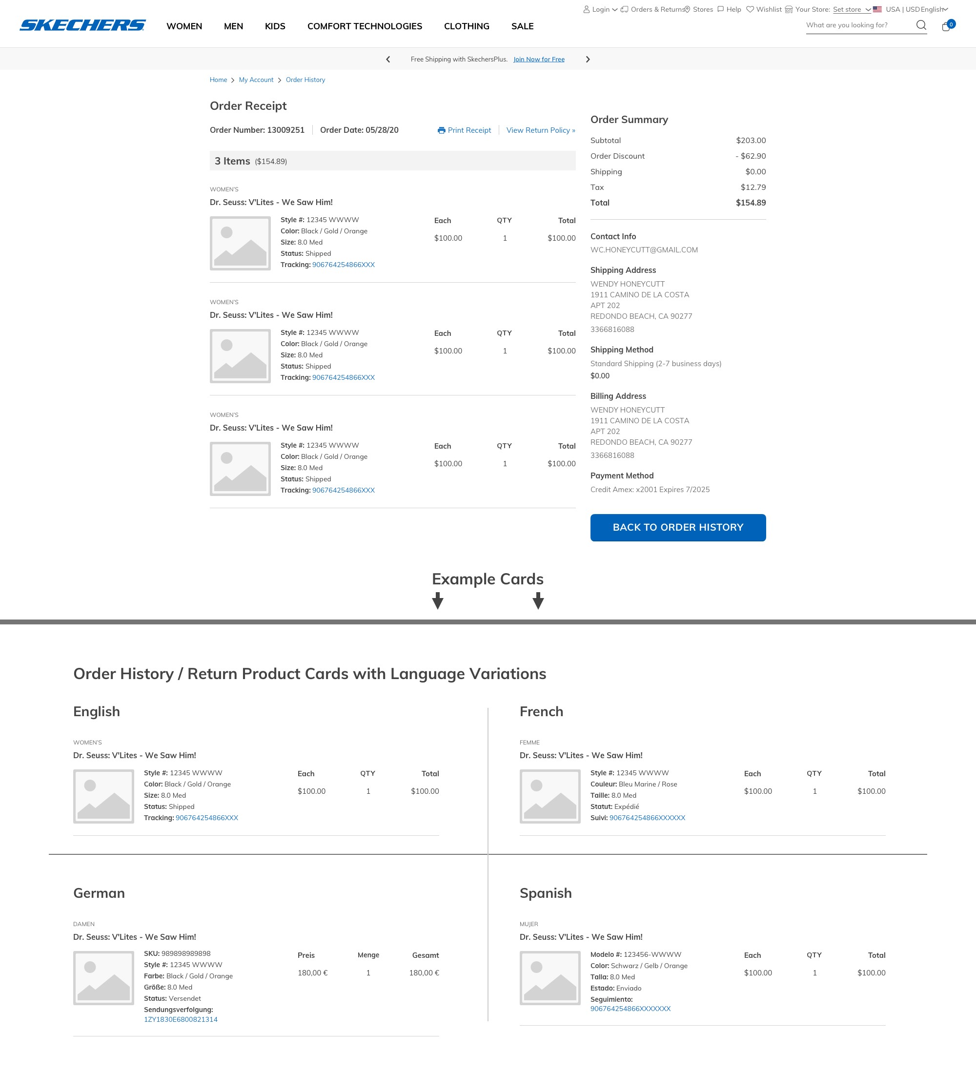
The connected experience needed to work across desktop, tablet, and mobile while supporting approximately 180 countries and 52 languages. Order Receipt introduced the greatest complexity because status messages, eligibility dates, and available actions could vary by region and expand significantly when translated.
I designed the item cards and action hierarchy to reflow across breakpoints, accommodate longer strings, and preserve clear primary and secondary actions. Flexible policy messaging allowed regional teams to communicate local return or cancellation requirements within a consistent component structure.
Business and Customer Impact
The redesigned post-purchase experience produced measurable results across Order History, Order Receipt, and the broader customer journey.

This project reinforced the value of treating Order History and Order Receipt as one connected experience rather than two separate pages. By designing around changing order states, customer actions, responsive behavior, and global requirements, I created a flexible system that made post-purchase information easier to understand and manage. Most importantly, the work showed how thoughtful improvements to an existing experience can reduce customer friction while creating measurable value for the business.