MunchRun is a 4-month end-to-end redesign of a hyperlocal food delivery app serving urban neighborhoods across 12 cities.
Role
Duration
Tools
Team
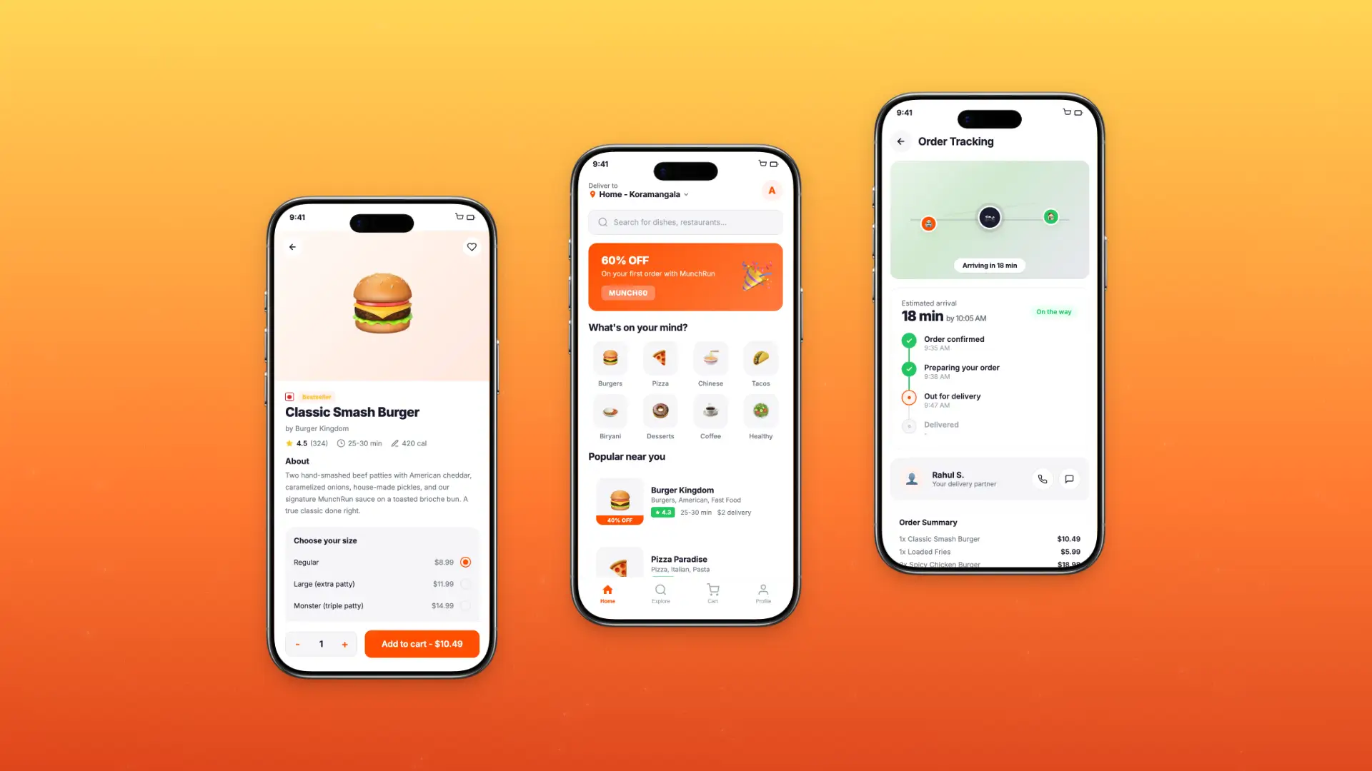
Project Overview
MunchRun is a food delivery platform serving 50,000+ active users across 12 cities, connecting customers with 1,800+ local restaurants. The existing app had grown organically over 3 years, resulting in an inconsistent experience that was hurting retention and order completion rates.
I joined as the sole Product Designer to rebuild the end-to-end ordering experience, from restaurant discovery to post-delivery review, with a focus on speed, clarity, and delight.
50K+
Active Users
1800+
Restaurant Partners
10
Enter the value
12
Cities Served
Problem Statement
MunchRun's app had a 54% cart abandonment rate and a declining 3.1-star App Store rating. Users were dropping off primarily during the customization and checkout flow due to confusing UI patterns and a lack of real-time feedback.
62% of drop-offs occurred during the item customization step
Users spent an average of 6.8 minutes placing a single order
45% of support tickets were related to order tracking confusion
Repeat order rate had declined from 61% to 44% over 8 months
New user retention at day-7 was at a low 22%
Research & Discovery
I ran a 3-week discovery phase combining in-app analytics, user interviews, and a competitive audit of 6 major delivery platforms.
18
User Interviews
3200
Session Recordings Analyzed
10
Enter the value
6
Competitor Audits
Key Findings
74% of users found the customization screen overwhelming and unclear
Users expected real-time delivery tracking but received only static ETAs
Repeat customers wanted a faster reorder path but couldn't find one
The restaurant discovery page lacked meaningful filtering, frustrating new users
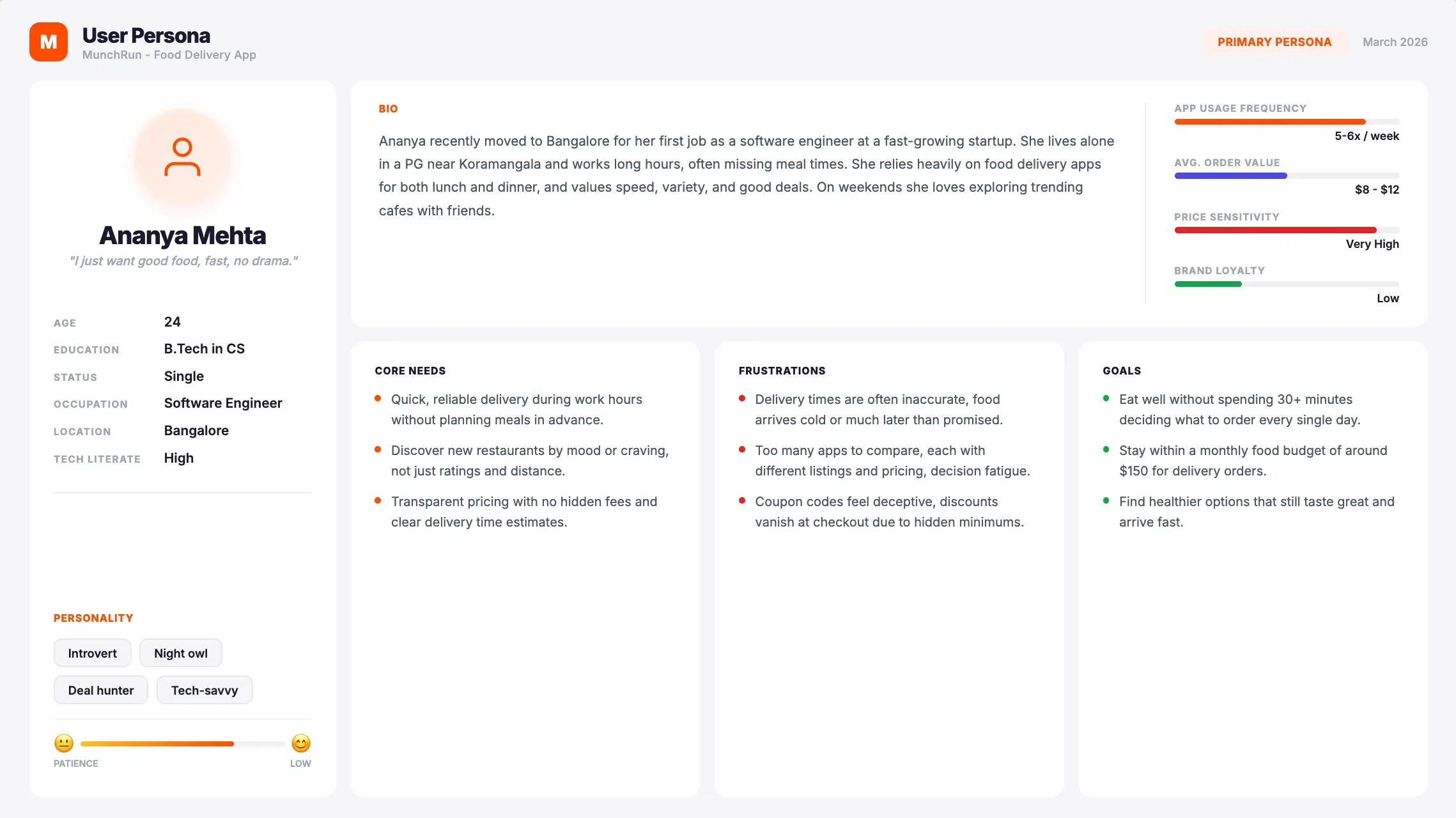


I ran a 2-day design sprint with the product and engineering team. Using how-might-we questions, affinity mapping, and storyboarding, we generated 90+ concepts and narrowed them down to 2 strong directions.
We chose "QuickFlow" - a concept built around reducing decision fatigue by surfacing smart defaults, saved preferences, and a one-tap reorder system at every touchpoint.
Phase I - Redesigning Order History
The original Order History experience relied on item numbers and text, making past purchases difficult to recognize at a glance. It did not clearly communicate an order’s current status, show the products included, or provide an intuitive entry point into the full order.
I redesigned the page around visual, clickable order cards that surfaced the information customers needed to identify a purchase before opening it. Each card displayed product imagery, overall status, online order number, order date, and total. The card system also accounted for multi-item orders, repeated quantities of the same product, and orders containing more products than could be displayed at once.

Card Anatomy
Each Order History card was designed to help customers recognize a purchase before opening it. Product imagery and overall status provide immediate context, while consistent metadata supports verification. Quantity badges and overflow counts communicate larger or repeated orders without overcrowding the card, and the chevron makes the transition into full order details clear.

Designing for Different Order Compositions
Orders could include a single product, several different products, multiple quantities of the same item, or more products than the card could display. I defined responsive card rules for each scenario, ensuring customers received an accurate and scannable summary across desktop, tablet, and mobile. Quantity indicators identified multiple units of the same product, while an overflow count showed when an order contained more items than the card could display. Customers could select the card or arrow to open the full order and view every product included in the purchase.
I also introduced a loyalty-status pill that displayed the points earned from each purchase. Its placement and spacing adapted across breakpoints, allowing customers to quickly understand both their order and its loyalty value without competing with essential details such as status, date, and total.

User Flow
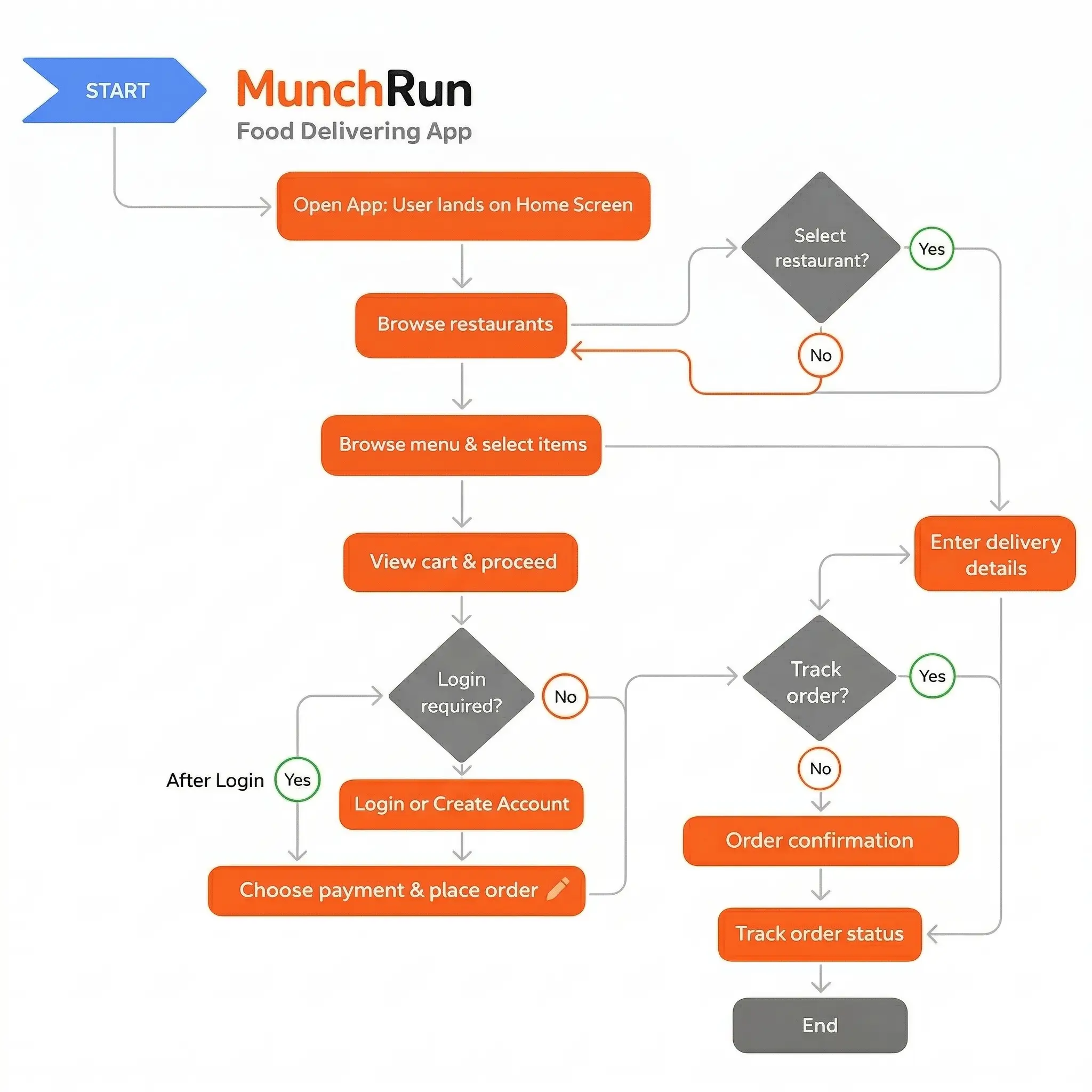
I mapped three primary journeys: new user discovery, repeat order, and live order tracking. The main goal was cutting the average order time from 6.8 minutes to under 3 minutes.
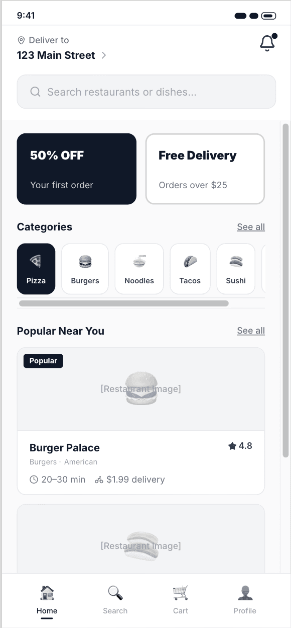
Discovery to cart - personalized feed with smart filters and restaurant cards showing live wait times
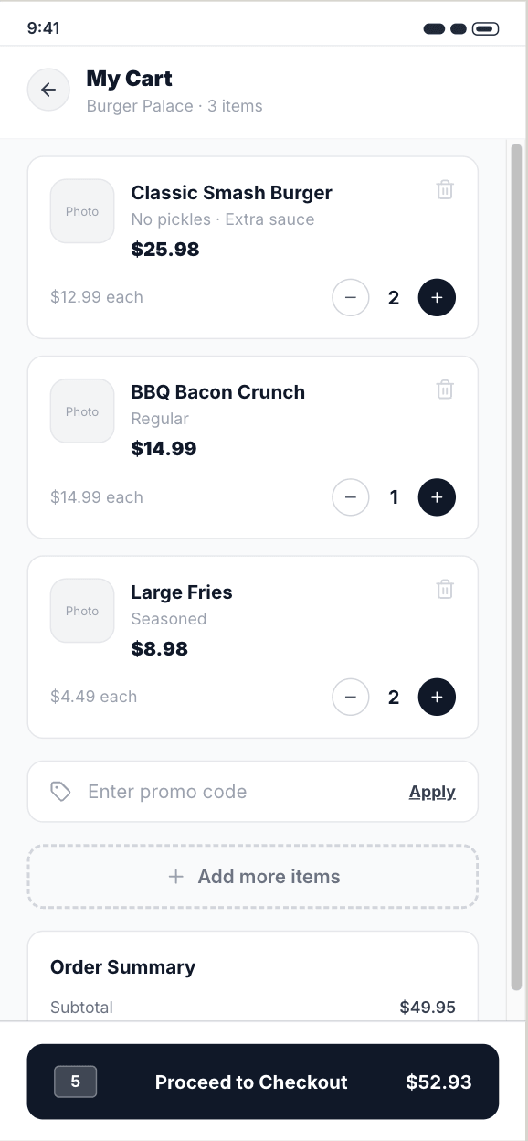
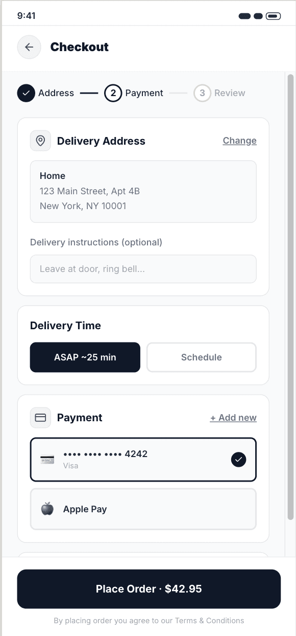
Customization to checkout - single-screen item builder with inline upsells and saved preferences
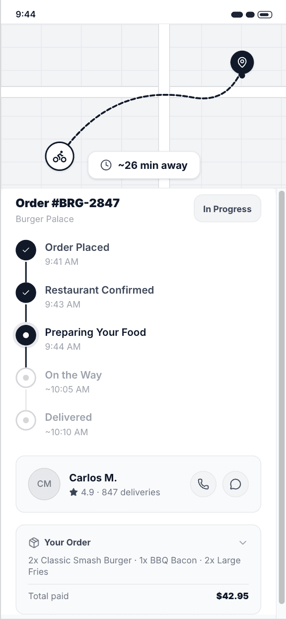
Post-order tracking - live map view with push notifications and estimated arrival countdown

Wireframing
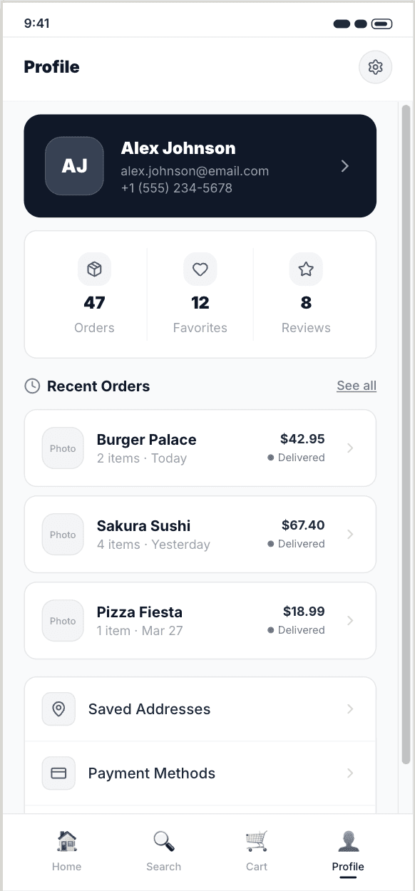
I designed wireframes for 22 key screens, moving from rough sketches to mid-fidelity layouts across 3 iterations. Each round was tested with 6 participants via hallway usability sessions.
The final wireframes achieved an 88% task completion rate, compared to 51% on the original app.


Visual Design
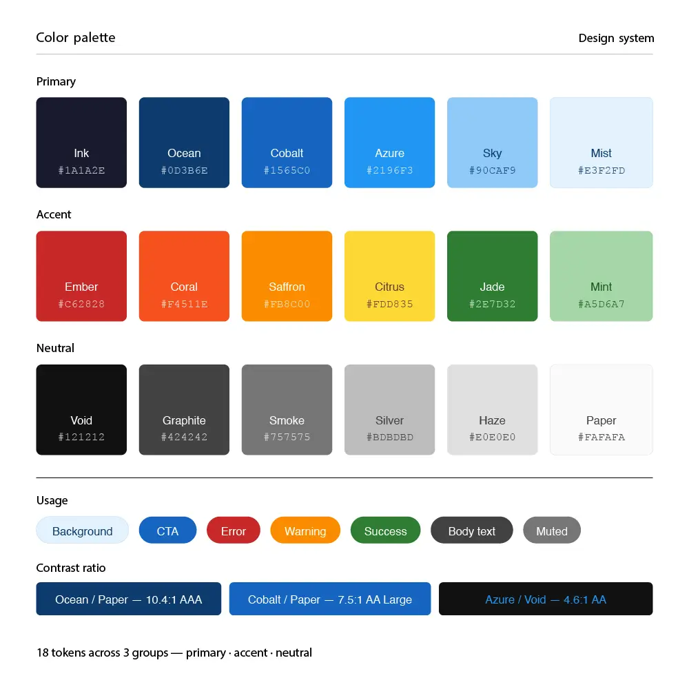
The visual direction needed to feel energetic and appetizing while remaining fast and functional. I developed a warm, high-contrast design system using a saffron and charcoal palette with rounded components to keep the tone friendly and approachable.
Prototyping & Testing
I built a high-fidelity prototype in Figma and ran 4 rounds of moderated and unmoderated testing with 28 participants using Useberry for remote sessions.
28 Test Participants 4 Testing Rounds 91% Task Success Rate
"Ordering feels so much faster now. I didn't have to think at all - it just guided me through."
Final Design
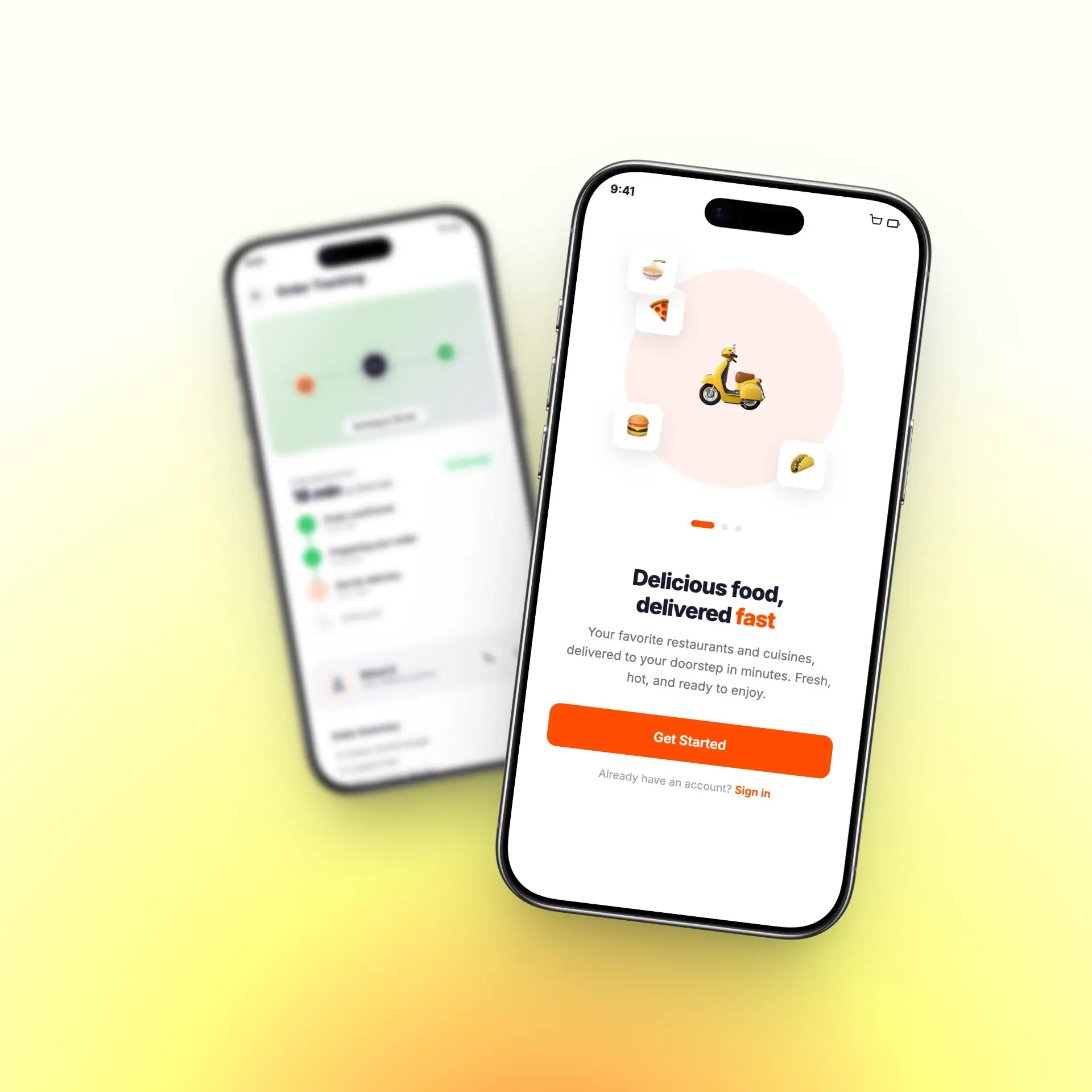
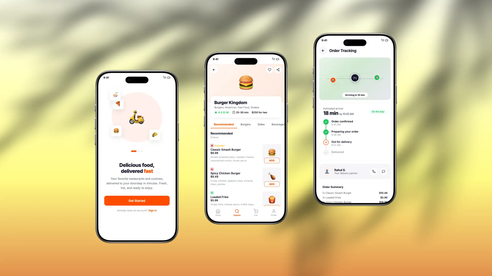
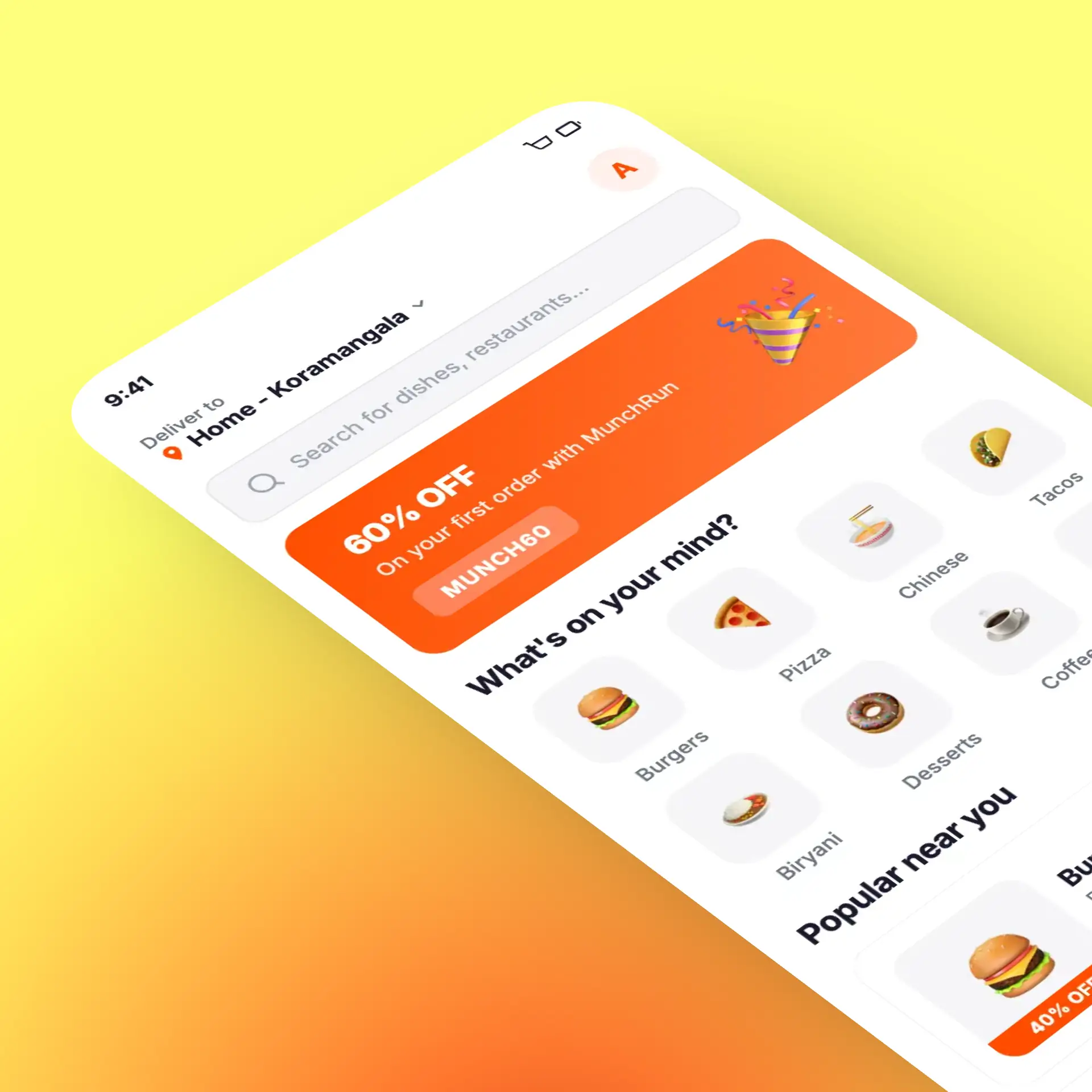
The final design, "QuickFlow," delivers a fast, frictionless ordering experience with a strong visual identity. Key features include:
One-tap reorder with saved preferences and last delivery address
Smart restaurant discovery with real-time wait time indicators
Single-screen item customization with inline add-ons
Live order tracking with animated map and delivery updates
Personalized home feed based on order history and time of day
Full accessibility compliance with WCAG AA contrast and touch target standards
Order History Solution

Order Receipt Solution


Responsive and Global Considerations
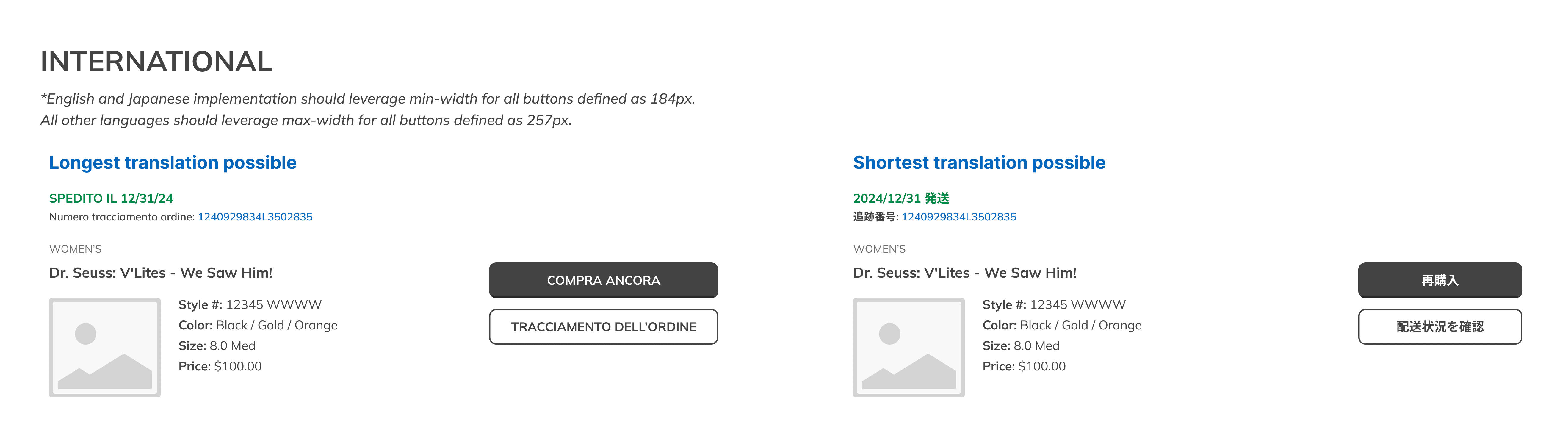
The connected experience needed to work across desktop, tablet, and mobile while supporting approximately 180 countries and 52 languages. Order Receipt introduced the greatest complexity because status messages, eligibility dates, and available actions could vary by region and expand significantly when translated.
I designed the item cards and action hierarchy to reflow across breakpoints, accommodate longer strings, and preserve clear primary and secondary actions. Flexible policy messaging allowed regional teams to communicate local return or cancellation requirements within a consistent component structure.
Business and Customer Impact
The redesigned post-purchase experience produced measurable results across Order History, Order Receipt, and the broader customer journey.

54%
Reduction in cart abandonment
4.6
App Rating
10
Enter the value
40%
Increased Order